- Packages I will use to read in and plot the data
- Read the data in from part 1
Interactive graph
- Start with assigning “Prevalence_in_females” to myxaxis
- Assign “Prevalence_in_males” to myyaxis
- Start with the data
- Group_by region so there will be depression prevalence males vs. females by region
- Use e_charts to create an e_charts object with myxaxis on the x-axis
- Use e_scatter_ to show and label the regions and the relationship between the graphed points
- Use e_grid to position the labels of the regions 30% to the right
- Use e_legend to format the orientation, and position of the labels, being vertically oriented, positioned to the right, and 15% close to the graph
- Use e_tooltip to add a tooltip that will display based on where the x and y axis meet, called a cross.
- Use e_title to add a title, subtitle, and link to subtitle
- Use e_theme to change the theme to roma
myxaxis <- "Prevalence_in_females"
myyaxis <- "Prevalence_in_males"

regional_prevalence %>%
  group_by(Region) %>%
  e_charts_(x = myxaxis) %>%
  e_scatter_(serie = myyaxis,symbol_size = 7) %>%
  e_grid(right = '30%') %>%
  e_legend(orient = 'vertical', right = '5', top = '15%') %>%
  e_tooltip(axisPointer = list(type = "cross")) %>%
  e_title(text = "Prevalence of depression, males(y-axis) vs. females(x-axis), 2019",
          subtext = "(Percent based on population historical estimates) Source: Our World in Data",
          sublink =
            "https://ourworldindata.org/mental-health#prevalence-of-depressive-disorders",
          left = "center")%>%
  e_theme("roma")
Static graph
- Use ggplot to create a new ggplot object. Use aes to indicate that Prevalence in females will be mapped to the x axis; Prevalence in males will be mapped to the y axis; regions will be the colour variable
- Use theme(legend.position = “bottom”) to put the legend at the bottom of the plot
- Labs sets the y axis, x axis, and the subtitle a label, fill = NULL indicates that the fill variable will not have the labelled Region. The x axis will be labeled “Prevalence in females”, the y axis will be labeled “Prevalence in males”, and the subtitle will be labeled “Prevalence of depression, males vs. females, 2019”.
ggplot(regional_prevalence) +
  geom_point(aes(x = Prevalence_in_females, y = Prevalence_in_males, colour = 'regions')) +
  theme(legend.position = "bottom") +
  labs(y = "Prevalence in males", fill = NULL) +
  labs(x = "Prevalence in females", fill = NULL) +
  labs(subtitle = "Prevalence of depression, males vs. females, 2019")
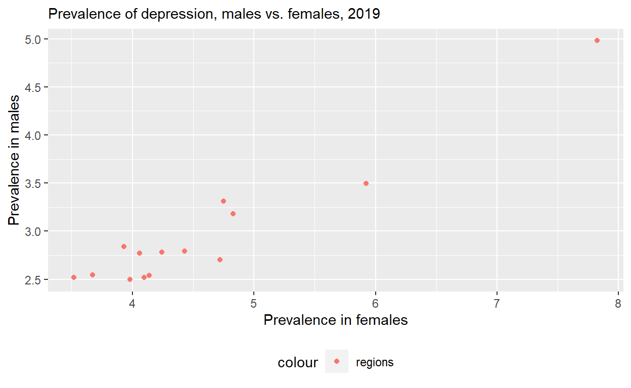
These plots show that in 2019 women suffer more from depressive disorders than males. however they are still relatively close to each other.
- note: on Rstudio the graph was color coded and all regions was shown in the bottom legend. However, once I build the website it did not color code, neither did it display the full bottom legend. But you said it was fine on zoom, to leave it as is.