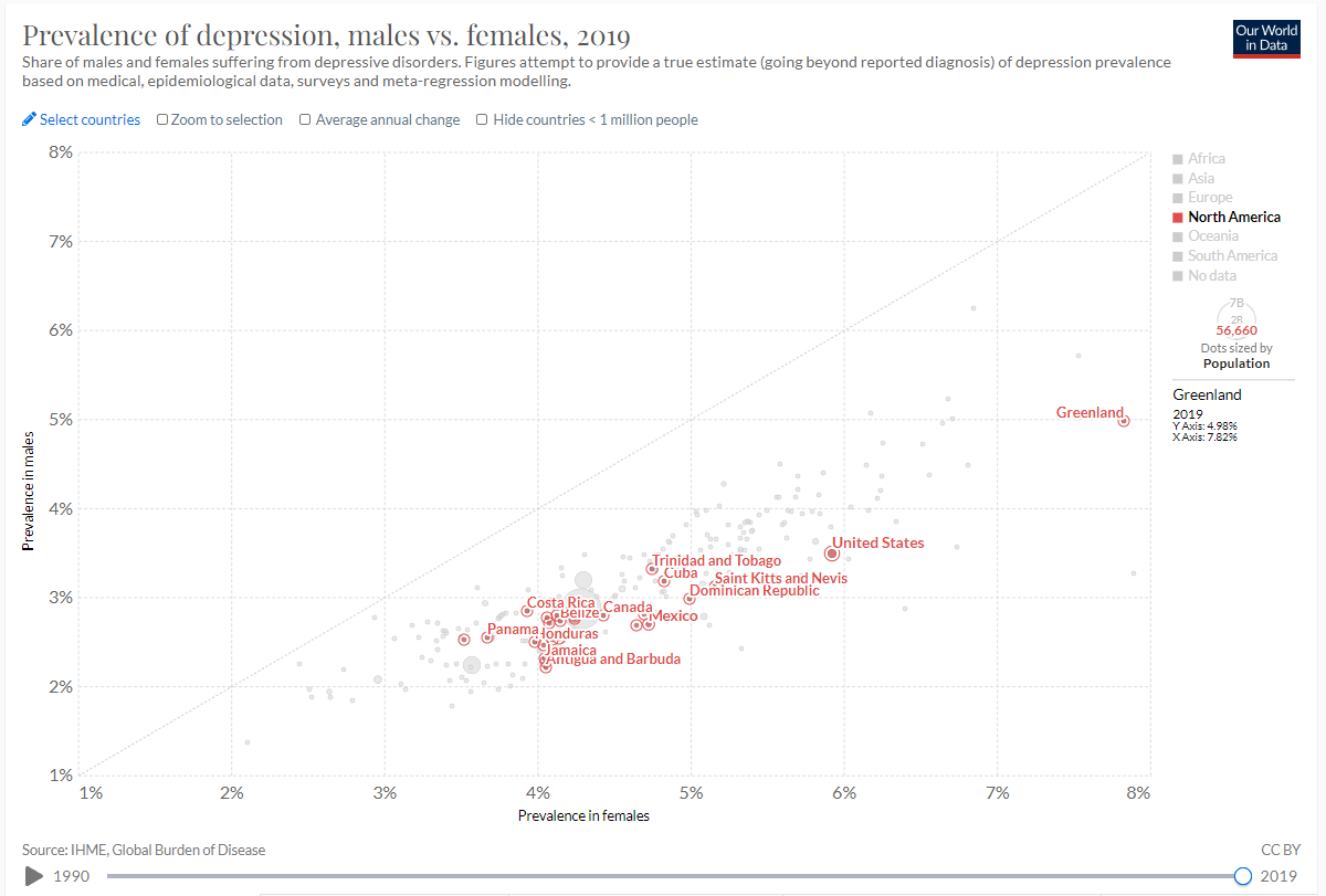
I downloaded the prevalence of depression data from Our World in Data. I am interested to see how depression has prevailed before COVID-19 hit and depression risk rose among the population. I selected this data because I am interested in risk of depression, male vs female, from 1990 through 2019.
This is the link to the data.
The following code chunk loads the packages I will use to read in and prepare the data for analysis.
- Read the data in.
- Use glimpse to see the names and types of columns.
glimpse(prevalence_of_depression_males_vs_females)
Rows: 56,395
Columns: 7
$ Entity                                                                            <chr> ~
$ Code                                                                              <chr> ~
$ Year                                                                              <int> ~
$ Prevalence...Depressive.disorders...Sex..Male...Age..Age.standardized..Percent.   <dbl> ~
$ Prevalence...Depressive.disorders...Sex..Female...Age..Age.standardized..Percent. <dbl> ~
$ Population..historical.estimates.                                                 <dbl> ~
$ Continent                                                                         <chr> ~
#view(prevalence_of_depression_males_vs_females)
- Use the output from glimpse (and View) to prepare the data for analysis.
I will create the object
regionsthat is a list of regions I want to extract from the data set.Change the name of the first column to Region, the forth column to Prevalence in males, fifth column to Prevalence in females, and sixth column to Population historical estimates.
Use filter to extract the rows that I want to keep: Year == 2019 and Region in regions
Select the columns to keep: Region, Year, prevalence in males, prevalence in females, and population historical estimates.
Assign the output to regional_prevalence
Display the first 10 rows of regional_prevalence
regions <- c("Barbados",
             "Bermuda",
             "Canada",
             "Costa Rica",
             "Cuba",
             "El Salvador",
             "Greenland",
             "Honduras",
             "Mexico",
             "Nicaragua",
             "Panama",
             "Puerto Rico",
             "Trinidad and Tobago",
             "United States")

regional_prevalence <- prevalence_of_depression_males_vs_females %>%
  rename(Region = 1, Prevalence_in_males = 4, Prevalence_in_females = 5, Population_historical_estimates = 6) %>%
  filter(Year == 2019, Region %in%  regions) %>%
  select(Region, Prevalence_in_males, Prevalence_in_females)

regional_prevalence
Region Prevalence_in_males Prevalence_in_females
1 Barbados 2.520536 4.095250
2 Bermuda 2.538913 4.139267
3 Canada 2.791180 4.431246
4 Costa Rica 2.840404 3.931126
5 Cuba 3.182001 4.828859
6 El Salvador 2.781834 4.242798
7 Greenland 4.979977 7.824329
8 Honduras 2.497141 3.979869
9 Mexico 2.701578 4.721953
10 Nicaragua 2.770215 4.059803
11 Panama 2.545403 3.673961
12 Puerto Rico 2.520028 3.520164
13 Trinidad and Tobago 3.311599 4.749951
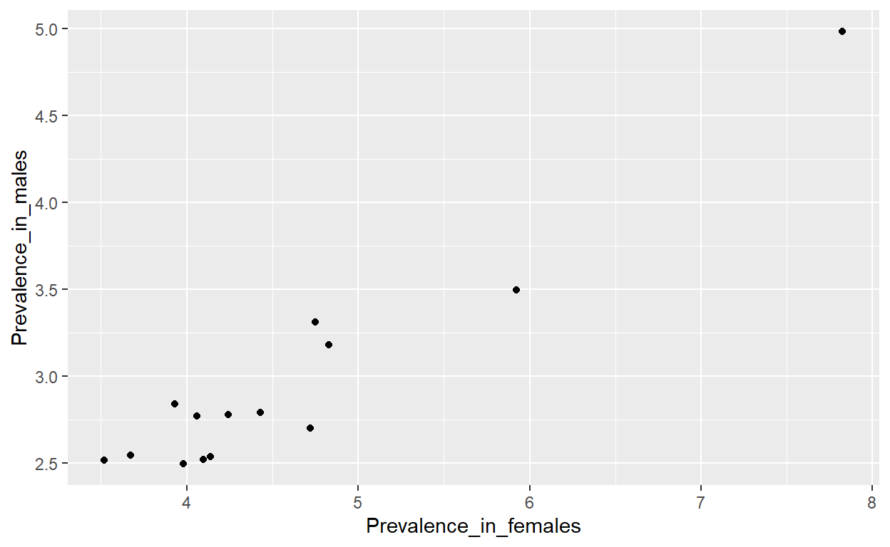
14 United States 3.495791 5.924440Checked that the graph is the same as the one I am trying to recreate. As a point of reference I used Greenland with male prevalence of: x = 4.98% and female prevalence of: y = 7.82%
ggplot(regional_prevalence) +
  geom_point(aes(x = Prevalence_in_females, y = Prevalence_in_males))
Add a picture
write the data to file on the project directory
write_csv(regional_prevalence, file= "regional_prevalence.csv")